
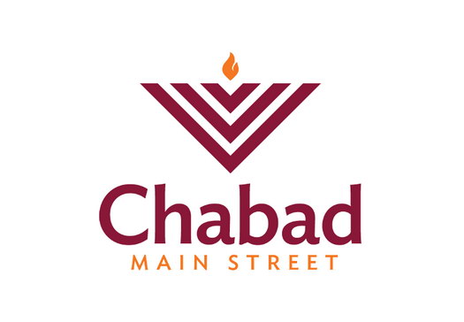
Graphic Designers Create Universal Chabad Logo
Lemon Place, a small Crown Heights-based graphic design company, took it upon themselves to make an open-source Chabad logo that any Shliach can use free-of-charge, in the hopes of uniting Chabad houses across the globe with uniform branding.
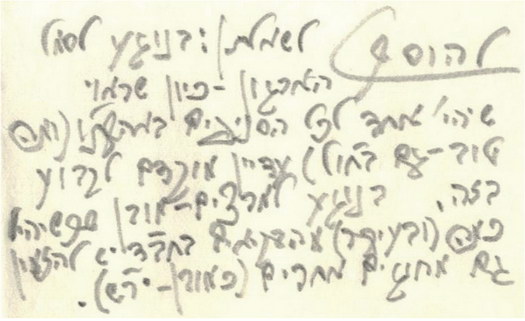
Lemon Place designer Sruly Lipszyc wrote the following article detailing the lengthy process behind the logo’s creation, which includes a handwritten note from the Rebbe on the subject from 1965:
One Chabad Logo
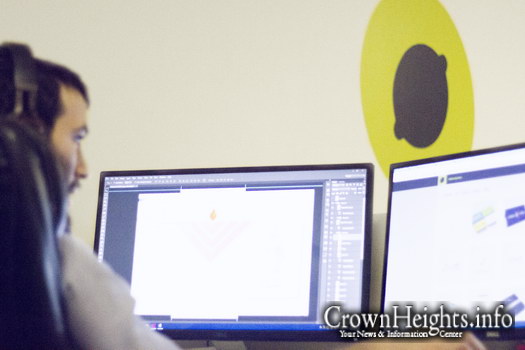
Every other week, we at Lemon Place Creative get an email from a new Shliach who’s just moved down on Shlichus in need of a logo for his new center. It’s crazy to watch these financially strapped Shluchim reinvent the wheel that is the Chabad logo. With 3,500+ centers around the world, that problem must have been solved too many times.
What I want to ask them is “Why can’t you just use Chabad X’s logo for yourself”? The thing is, how would a Shliach actually go about doing that? He would first have to go to the other Shliach and get permission to do so, and then see if the original designer can customize it.
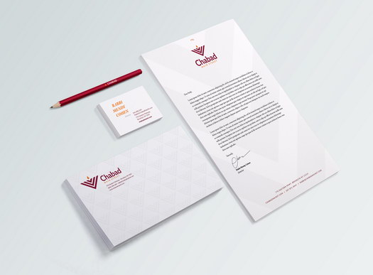
With this in mind, we have set about creating the open Chabad logo. A logo for Chabad centers worldwide that can be used and customized by any shliach. Download it for free here, scroll to the bottom of the page for download box.
Should Chabad centers use a single logo?
In response to a Chabad women’s organization in Israel the Rebbe wrote “Regarding what was asked: about the organization’s symbol — since it’s appropriate that there should be a single (logo) for all the (organization)branches of our holy land “may it be speedily rebuilt” (and even better — also those branches in diaspora), it is still early enough to have this established….”
Now let’s consider the benefits:
- Brand awareness and authority. For example, if a person is in one town and saw the Chabad logo at an event or on a postcard in the mail, he’ll be more likely to join the event of another Shliach using the same logo.
- It will create an ecosystem of marketing materials around a unified brand. Printed materials, branded products, custom kippas etc. can all be customized with one unified logo and ordered in bulk, driving the cost down for everyone.
- When multiple Chabad centers make a joint event, one unified logo can represent them all. I once noticed a joint dinner which featured some 20 distinct Chabad logos, half of which were almost identical with slight differences. The logos occupied almost half of the invitation in 3 rows of tiny logos, some of which were totally illegible.
- It saves a lot money and energy for a Shliach at a critical time, when they are starting out.
Now let’s take a look at the possible downsides.
The first one you’ll hear is the need for a localized logo. A center in Cancun needs palm trees in their logo and a center in Manhattan needs skyscrapers.
To answer this, consider any organization with many branches around the globe. Take Starbucks, for example. Is the logo for Starbucks in New York City any different than the one in Montgomery, Alabama? No! Starbucks is not here to advertise NYC. If you’re seeing their logo you’re probably there already. Starbucks’ message is universal that when you see their branding you should think, “Here is a great place to grab a coffee.” Similarly with Chabad, the logo should be telling you “find out more about your yiddishkeit in a warm and accepting environment.”
This answer is true if a person can expect the same experience at each Chabad he visits. What about places like Mexico where the Chabad setting is somewhat more relaxed and spontaneous?
For those kinds of locations you can consider using a variant of the logo. This project was created with the the majority of Chabad centers in mind, where you can expect somewhat similar experiences. The Chabad centers that have weekly Minyanim, Adult Education programs, youth programs and the like.
Another concern you may hear for requiring a distinct logo is in order differentiate from other nearby Chabad centers so a person doesn’t mistakenly attend the wrong event.
For the Shluchim in the same neighborhood, this will be an issue, and I suppose one of them will have to differentiate if he doesn’t want a Jew mistakenly showing up at another Shliach’s event. (One could argue that Shluchim shouldn’t care which location a person chooses to go to, as long as he/she is connecting to Yiddishkeit, however this is not currently the reality on the ground.)
*********
Now that we’ve determined the need for a unified Chabad logo, what should it be?
First, I recommend watching this 5 min. clip on “What makes a truly great logo.”
Now let’s dig deeper, look at some of the most popular brands in the world, and see what they have in common.
- They all can work in black and white, this helps you use the logo in more situations, for instance as a silver sign you have in the lobby in your office. A logo’s value comes from repetition, repetition, repetition. The more times I see it, the more likely I am to remember it and start associating my thoughts and feelings about the organization with the logo. Therefore, the easier it is to use a logo, the more it will be used.
- Use only one font. Using only one font makes it easier to read and also makes the logo not be an eyesore on the different marketing materials. Some marketing ads might already be using two fonts of their own, and now you want to put a logo on there that won’t clash with the design. If it has two fonts, it is more likely to look out of place.
- Type is separated from the icon. This allows the text to be centered on the bottom of the icon or put on the side when necessary, for example on the top of your website. Again, the more flexible a logo is, the more likely it is going to be used, and a logo’s value only comes from repetition, repetition.
- The logos can be drawn in under 10 seconds. By having this little detail it allows the logos to work in small sizes, makes it easier to remember, and when it’s simple, it has a bigger chance of not looking dated 10–30 years from now.
- It is not necessarily interesting or trying to tell a story. Is the apple logo creative or saying anything about the company itself? No, because that isn’t the point of a logo. The point of a logo is to anchor people’s experiences with the organization.
*********
Now let’s do a quick Google search for “Chabad Logos” and see if there’s a pattern that we can use in our logo.
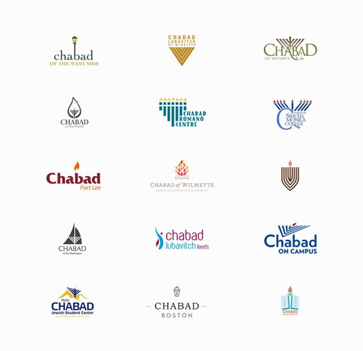
Do you see it? Most Chabad Logos make use of a flame or the triangled Menorah. And it makes sense; Chabad’s success comes from the warmth of our Shluchim. So if you wanted to say “warm” you can use a flame. It also makes sense to use a Jewish symbol, and if you wanted to pick a warm Jewish symbol, what better way than the Menorah?
We also get some differentiation points for using the Rambam’s description of the Menorah being angled.
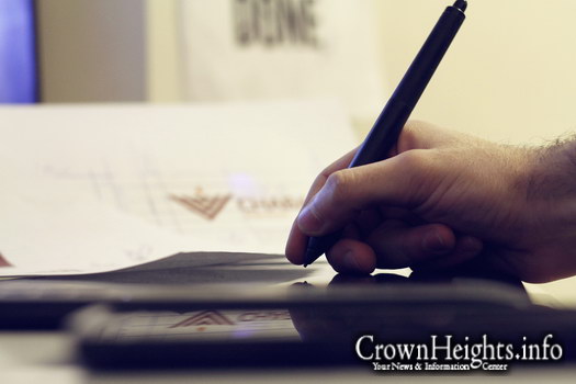
Ok, so now that we know all the above, let’s go make a logo. First let’s start with the icon:
Icon
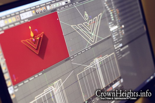
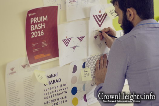
Draft 1. A flame with a triangle that represents the Menorah.

The issue is that this ends up looking like a memorial lamp and looking sad, not what you want out of a Chabad logo.
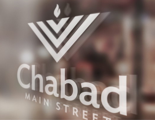
Draft 2. I made the Menorah in as simple a way as I could with it still clearly being a Menorah. This Menorah is a model for Chabad, there are many branches but all come from the same base.
In an earlier version I also gave the Menorah a horizontal curve across the top so it feels more open, however, “the Rebbe said that for children it is important that they see accurate images and not caricatures. The Rebbe added that it should be said that this is important for adults as well…”
— heard from Rabbi Mendel Hecht, Greenfield MA.

There we go, much better.
Font
We want a font that is easy to read, appropriate, and works well with the icon.
For this I consulted the wonderful team at Spotlight design to use a Chabad trademarked typeface. Enter Ideal San, allergic to geometry: the design takes every opportunity to resist formulaic rules. These policies make Ideal Sans engaging at large sizes, and help it to perform at small ones, giving the design a warm, organic, and handmade feeling.

Color
For our primary colors let’s go with warm red and orange colors.

Wait! Isn’t that the same colors as Chabad in Israel? Yup, they are similar. That’s because they got it right; this combination is warm (deep red) and energetic (bright orange). It’s not too feminine or masculine. It’s also distinct enough to be recognizable.
I considered many other colors, for example a navy and yellow combo, as it is easy to use, however it was missing a certain “classiness” feel, so I had to let it go.
Voila! One Chabad logo to rule them all.
Note: if the color is what threw you off using this logo, I think it’s ok to at least use the icon with your own colors. You will still retain many of the benefits of using a shared logo.
I followed this list by Tanner Christensen, author of The Creativity Challenge, for creating a good logo.
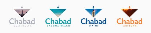
Let’s explore some examples of how this might work in the real world.


Some examples are more colorful and modern and others are more conservative and classy, showing the flexibility available in the identity.
**********
Making the logo work for you
When appropriate, change up the logo to make it match the experience. For your preschool have a kid make the logo with crayons. I made a few examples so you can get the idea.

Sometimes you will want to differentiate from other Chabad logos, and customize it to your location, for example, when creating your facebook profile picture.
Now that we have the logo, how do we get Shluchim to use it?
Step 1. Write a medium article on the importance of having a unified Chabad logo. Check!
Step 2. Give the logo and branded elements away for free. Check! Click here to download, scroll to the bottom of the page for download box. Coming soon: there will be a website where you can customize the logo with your location, as well as a brand style guide.
Step 3. The more this logo is in use, the better it becomes. So share the logo with fellow Shluchim, and get a conversation going. I did my part, now the rest is on you.


From a marketing professional
Well intended, I’m sure. However the marketing theories offered in this article (specifically starbucks) are poor. Using Starbucks as an example: Starbuck’s expansion into many markets actually failed because of their inability to cater to local cultures and offer a unique product. Google for more info.
The use of a standard logo may offer a few financial benefits (mass production of promotional goods). Within a similar market segmentation this approach is healthy. However in a cross-culture/international market this is not advisable.
Best of luck.
To Mr. Marketing Professional
Hello “Marketing Professional”… I think you missed the point. The Starbucks logo (or any other international company such as 7-11, McDonalds or IKEA) is identical wherever it is in the world. However, each of these brands (Starbucks included) have decked out their stores in a way which is unique to that specific location. This way they have maintained their international presence but at the same time localized the experience while visiting the store.
Logos are over rated....
I don’t think the op is saying that they want to get rid of the personal atmosphere and local culture of each chabad. Starbuck’s (very slight) expansion failure wasn’t in its logo, rather it was in in ability to offer a local and personalized experience. They mass produced an identical store/atmosphere in each of their thousand of locations.
The way I read it, it sounded like the op used the starbucks logo just to explain that a logo doesnt have to be personalized by location and that a single logo can give off a single message.
Once thing that chabad has is that we are personal and different, and so I don’t think we will have to worry about following starbuck’s failure “to cater to local cultures and offer a unique product”.
That being said….I think you and the op put too much stock in logos.
If customers have good experiences, then each time they see the brands logo it remind them of those great experience and makes them feel all good inside and want to come back. If customers have bad experiences, then each time the see the logo it bring back the bad memories/feeling no matter how good of a logo it is.
Sruly Lipszyc
Thank you for your feedback.
I do agree that logos are overrated…
…therefore why should each Shliach put in the time and money into solving the same problem.
Also i think more of the value will come from the shared marketing that can only happen if enough Chabad centers adapt this logo, then from the actual logo itself.
CCBilo
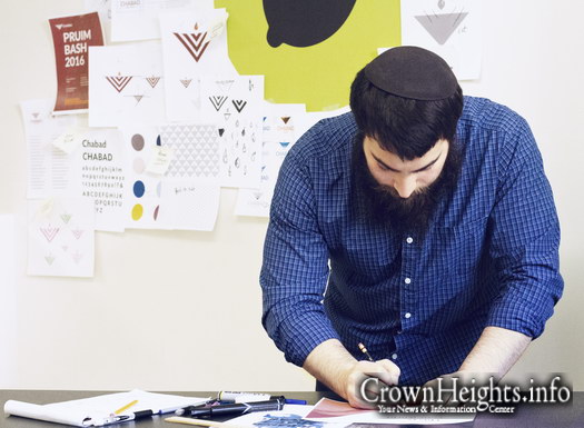
Its almost Pruim!
"PRUIM BASH"
Can you find it :)
Innerperspective
I definitely want to attend the PRUIM BASH 2016 (as seen in last picture)
Rabbi Elli
Why not make the Menorah accurate as you stated above for the sake of the children? 8 branches one shamash? This 6 branched image is misleading and will SURELY garner criticism.
love it
Where can I get a sweater?
Awesome
Having all chabad houses be recognized by 1 logo is genius. Its so nice that its free
enthusiastic
I think this is a brilliant idea!!!!! So creative and genius.. I hope this picks up steam, and we see this logo everywhere!
6 Branch Menorah?
Seems like with all the detailed planning this basic Menorah feature was overlooked…
Please explain yourselves here.
Sruly Lipszyc
This was something i discussed with many Shluchim before launching the logo. What i’ve been told is that Chabad of illinois logo (7 branch Menorah) has been on their stationery for over 30 years. Throughout all this time they’ve sent many letters to the Rebbe and the logo never received any comment.
Anonymous
Two issues i can think of:
#1 – free logo for any one to use? i could see this would surely present problems. There needs to be some overseeing body that maintains legal ownership and would pursue misuse court battles. i’d say this would introduce a new vector of challenges.
#2 – sure there is no obligation to use this logo; but what will be the case when … say 20% are using it and the rest aren’t? It may cause confusion: “are you chabad? i’ve been to many chabad houses and they look they same [have the same logo] and yours doesn’t….” Could become logo-geddon for a lot of mosdos (and there stationary, bumberstickers, etc.).
Pedant
This is very important. One logo to rule them all. Things of very great import are going on here.
Milhouse
Not that it affects your point, but you mistranslated a sentence in the Rebbe’s letter. עדיין מוקדם לקבוע בזה means it’s too early to make this decision. The Rebbe is telling the organization not to adopt a symbol yet, because he wants all the branches to have the same one, so they need to discuss it with all the other branches and adopt one together, not rush and adopt one for their branch that the others might not like.
Sruly Lipszyc
Thank you for that, I will try to update the article to reflect that.
GOOD JOB
I love it. I can’t believe how much I love it!
Couldn’t be better. Don’t change a thing.
Baruch Hashem.
A reader
Interesting answer of the Rebbe to Rabbi Cunin, which Chabad in Israel cited a few years ago when they united with one logo there, that just like the “Gimballs” supermarket chain, chabad show grow and grow and be known and identified as one big chain.
See here:
http://www.col.org.il/show_news.rtx?artID=59273
Aviva Shapiro
Wow — You all are so creative! And a pleasure to work with! Wishing you much continued hatzlocha!
Aviva Shapiro
a very satisfied customer!
why 6 branches?
why is the logo depicted using 6 branches?
either 7 or 8 would be better no?
Anonymous
The 7 is inferred from the flame in the center.
Leo de Toot
Excellent idea and a very positive addition to the international Chabad brand! However I would suggest that you license this mark instead of just offering it to be used by anyone. As I’m sure you’re aware, licensing does not require a fee – consider a “Creative Commons” approach for example as used in copyright which would require potential users to at least contact you and register their use for example. The danger of unlimited availability without any recourse is that a mark such as this quickly becomes a source of parody or even use in inappropriate media.
mechel kishmich
cool, but what is open-source about it?
Anonymous
That anyone can do anything they want with it, even to the extent of redesigning it and relaunching it.
Really really amazing!!!
#1 It’s truly amazing idea!! I just love it! 10 points!
#2 6 Branches isn’t what you see there there is also a shamash so that’s 7 and that is how it was in the beis hamikdash and that’s how the Rebbe thought us to do.
#3 Please do all you can to spread it!! It’ll be amazing and the main thing is that the band of Chabad will be in the entire world!!
You can’t just keep it there by putting up articles on Chabad websites it got to have a team of guys working on it.
I think that starting off with one head shliach doing it for example Chicago and then all shlochim there will change it and slowly we can conquer the world!!
It’s really nice and it needs to kick off!! I’ll do my part but everyone please do your part to make this happen!! Keep up the great work lemon place!
Imagine the entire world every shliach using this logo! Just imagine!
Love it!!
Love Lemonplace
Wow! What a great idea! You are so in tune with the Rebbe’s vision for shlichus- and you are so generous in heart and spirit! Kol Hakavod!
May you continue to be an inspiration to all – and may success continue to shine upon you beyond what you ever thought possible.
Works great in Israel
See a brochure in a local falafel place and voila – know it’s Chabad. Who cares which town it came from? The info is universal and that’s what Chabad should be.
Very nice of you to offer it free – certainly a bonus for start-up shluchim.
Good luck!
Chani
I love it! It’s such a great idea!
CH Homeowner
FYI: The Apple logo is indeed ‘telling a story’.
“Take a bite from the Etz haDaas – use our computer and taste from the limitless fount of knowledge, the www.”
chabad- lubavitch?
Wouldn’t it make sense to include Lubavitch in the logo just like all the official documents from the Rebbe?
Imagine the entire world every shliach using this logo! Just imagine!
No
Just a thought...
I think this logo is excellent an excellent idea, I just don’t think at should be open for anyone to use it. Unfortunately chabad has many individuals that CALL themselves Chana’s but in reality dot represent the rebbes vision at all. Therefore I think that merkoz leinyonei chinuch should be in charge of deciding who gets to legally use tho logo. Mech succes an kol hakavod